





Ten Years After the Manager Today Interview:
From Handwriting and Fountain Pens to Personal Signature Identity
In 2026, I opened a PDF that had been sitting in my archive for ten years.
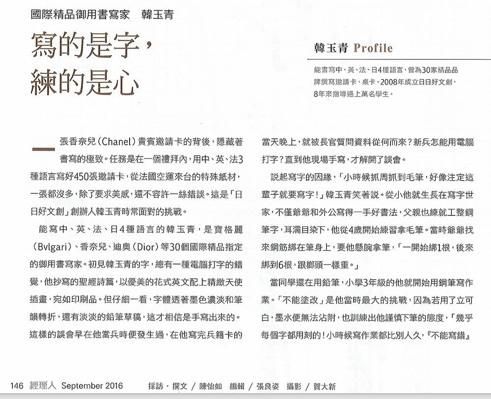
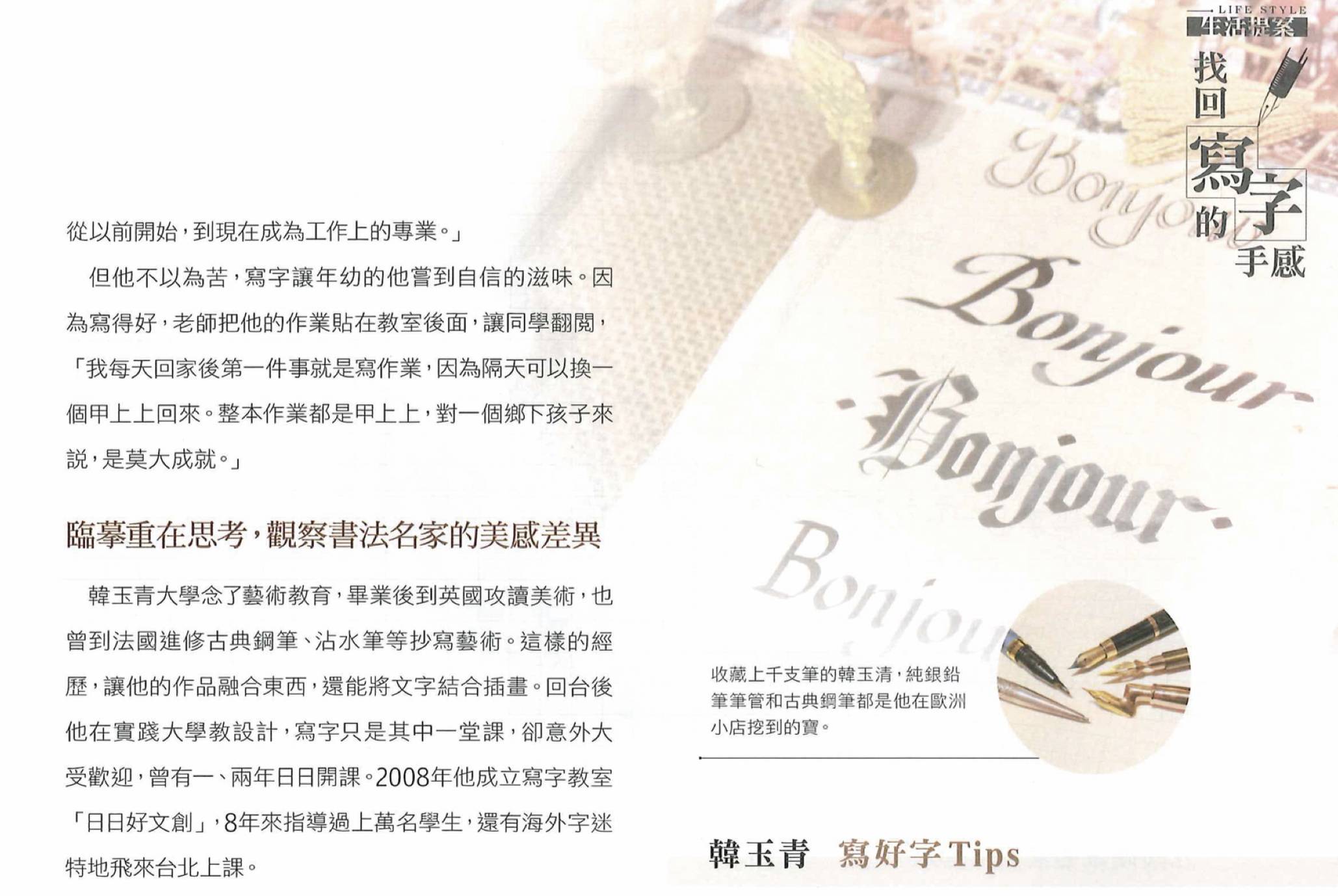
In September 2016, Manager Today, a Taiwanese business and management magazine, published an interview with me under the Chinese title 「寫的是字,練的是心」— “What We Write Are Characters; What We Practice Is the Mind.”
The article began with a Chanel assignment: 450 VIP invitation cards, handwritten in Chinese, English and French within one week. The paper had been specially shipped from France, with no extra sheets to spare. The handwriting had to be beautiful, but beauty alone was not enough. Every name had to be correct. Every line had to remain consistent. There was almost no room for error.
At the time, the magazine introduced me through my work as a calligrapher for international luxury brands, including Bvlgari, Chanel and Dior. It also traced my early experience with Chinese calligraphy, fountain pens, Western calligraphy and design.
Ten years later, however, those are not the lines that make me stop and reread the article.
I find myself returning instead to several things I said almost casually during the interview:
“Thinking is as important as practice.”
“Handwriting is connected to bodily memory — what we often call a sense of the hand.”
And another phrase that has stayed with me:
“Sometimes, going a little slower is actually faster.”
In 2016, I probably did not yet know that these scattered observations would eventually lead me from teaching handwriting to studying something much more personal: why a person struggles to write their own name, what kind of signature actually suits them, and how a designed signature can finally become something they are able to write naturally for themselves.
Ten years ago, the story was largely about someone who could write.
Today, I am more interested in what happens when I sit beside another person and begin to understand why they cannot yet write the way they want to.

Beautiful handwriting addresses the quality of writing. Signature design goes one step further: it considers how a person’s name functions as identity.

A beautiful line is not enough when handwriting enters real life
I started using fountain pens at a young age.
One of the things I remember most clearly was the pressure of not being able to erase easily. When I was a child, correction fluid did not always work well with fountain-pen ink, so I learned to approach the page carefully. I often took much longer than my classmates to finish an assignment.
Years later, that childhood habit reappeared in professional work.
A luxury-brand invitation may look effortless when the guest finally receives it. But behind that small piece of paper are questions the viewer never sees.
Is the name spelled correctly? Is the French accurate? How will this ink react to this particular imported paper? How many cards remain? After writing the three-hundredth name, can the line still maintain the same balance and quality as the first?
Once handwriting becomes professional work, aesthetics are only one part of the responsibility.
Consistency matters. Judgment matters. Accuracy matters.
The same lesson later became important in signature design.
A signature may look beautiful on the first sheet of paper, yet still fail in real life. Can the person reproduce it? Can it survive when written quickly? Does it still work at a smaller size? Does it feel appropriate on a formal document? Will the person still want to use it five years later?
A design that enters daily life cannot be judged only by its first impression.
Copying is not about becoming someone else
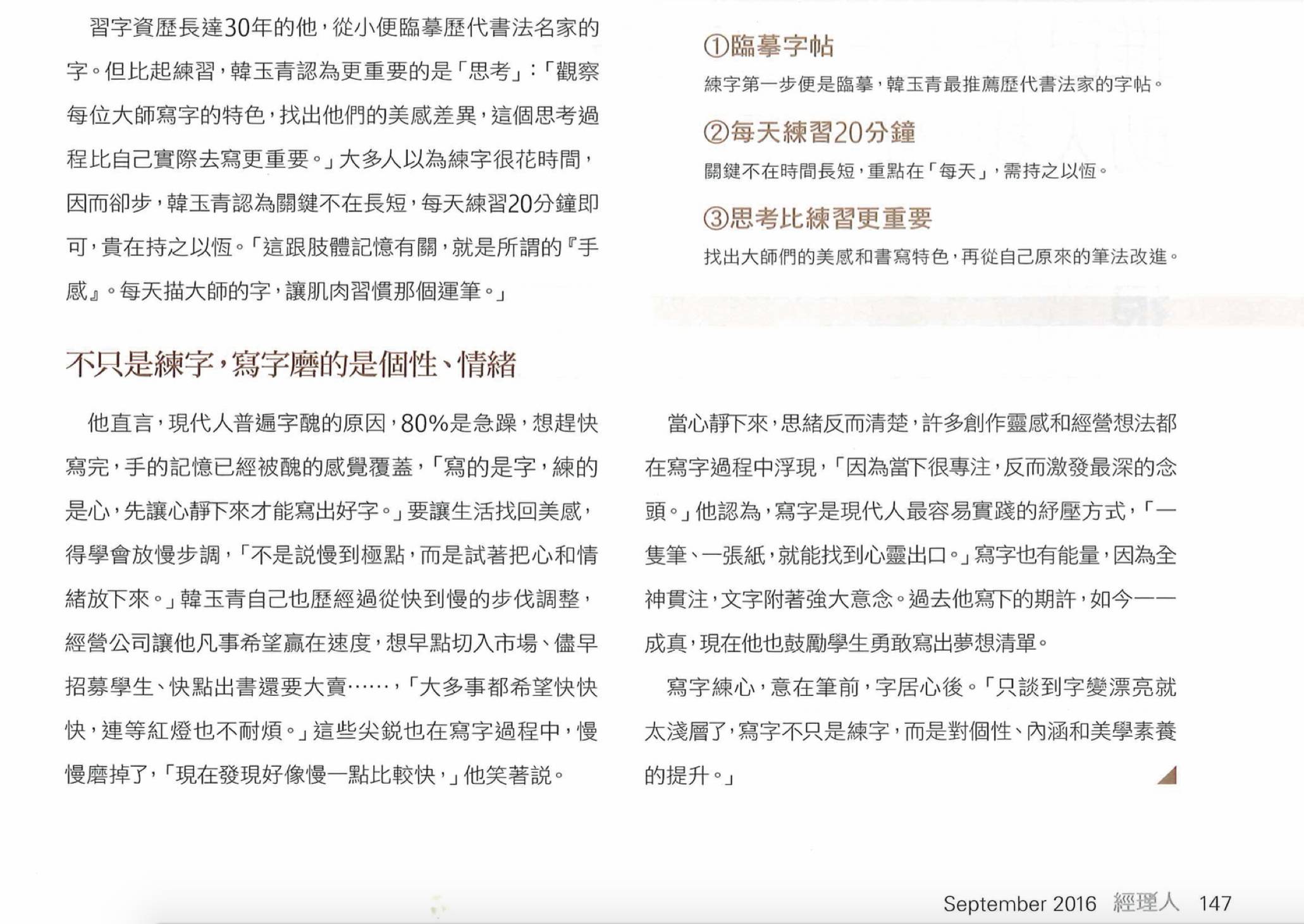
When Manager Today asked me about handwriting practice in 2016, I spoke about copying the work of historical calligraphers.
I had done this since childhood.
But what interested me was never simply whether I could reproduce a character accurately. What interested me was comparison.
Why can the same Chinese character look completely different in the hands of two great calligraphers?
One may feel grounded; another seems to move. One opens the internal space of the character; another compresses it. A horizontal stroke may be almost level in one style and carry a subtle upward motion in another.
Once you begin looking this way, handwriting stops being a collection of strokes.
It becomes a study of proportion, direction, weight, rhythm, negative space and balance.
My background in art and design made this way of seeing particularly natural to me. A Chinese character is language, but it is also form. It contains points, lines, shapes, visual density and spatial relationships.
And when several characters form a person’s name, another layer of composition appears.
This is why I still tell students:
When we practice handwriting, the hand is not the only thing being trained. The eye and our ability to judge are being trained as well.
A person may write a character one hundred times without ever noticing that every version repeats the same structural problem.
Another student may suddenly see, “My horizontal strokes always rise too sharply.”
That moment of recognition may change not just one character, but many others that share the same movement.
Good practice is not simply about writing more.
It is about learning to see more.
From teaching a room of beginners to watching one person’s hand
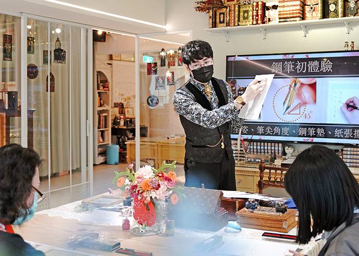
Around the time of the 2016 interview, Bonjour Everyday Creative — 日日好文創 — offered many short introductory handwriting classes.
A class might last about ninety minutes, with more than ten beginners sitting together. Many had never formally studied handwriting before.
In that setting, teaching had to be simple.
When the journalist casually asked, “How can people improve their handwriting?” I gave three practical answers:
Copy good examples.
Practice for twenty minutes every day.
Think as much as you practice.
Those answers are still useful.
But the way I teach today has become much more detailed.
Classes are much smaller, and some are one-to-one. This gives me time to sit beside a student and observe things that are almost invisible from the front of a classroom: how tightly the pen is held, where the hand hesitates, when the wrist stops moving, which turn becomes uncomfortable, or what happens when the writing speed suddenly increases.
One student once told us before a private signature lesson that one particular character in her name would often make her freeze when she had to sign quickly.
Her problem was not simply:
“My name is not beautiful.”
The more useful questions were:
Where exactly does the movement stop?
Is the structure unclear?
Is the transition between strokes unnatural for her hand?
Does she understand the form when writing slowly but lose it under time pressure?
Giving her a prettier model would not necessarily solve any of these problems.
That change in perspective may be one of the biggest differences between my teaching in 2016 and in 2026.
I used to answer the question:
“How can this character look better?”
Today I am much more likely to begin with:
“Why is this person unable to write it comfortably?”
For adults, your own name can be a very good place to begin
Many adults imagine handwriting practice as a thick workbook filled with hundreds or thousands of unfamiliar characters.
I often suggest something more immediate:
Start by looking at your own name.
A name is among the most familiar groups of characters an adult writes. It also carries unusually strong emotional weight because we have written it for years, often decades.
Chinese writing contains a vast number of characters, but the fundamental stroke movements repeat: horizontal and vertical strokes, dots, turns, hooks, left-falling and right-falling strokes, together with recurring structural relationships.
For many students, the characters in their own names already reveal several of their most persistent handwriting habits.
If the horizontal strokes in your name consistently tilt too much, learning to understand that direction does not improve only your name. The same understanding can transfer to other characters containing horizontal strokes.
There is also a psychological advantage.
Adults need a sense of progress.
Someone who has disliked their handwriting for twenty years may feel defeated if the first message they receive is: “You now need to relearn thousands of Chinese characters.”
But seeing their own name change can create an immediate and meaningful experience:
“So my handwriting really can change.”
That is why I often say:
Your name can be the entrance. The fundamentals are still the foundation.
The goal is not to make someone beautiful at writing only two or three characters.
The name simply gives us a familiar place from which to understand the hand.
Does twenty minutes of handwriting practice really work?
I still believe in the “twenty minutes a day” advice recorded in the 2016 interview.
But the important word was never twenty.
It was daily.
Twenty minutes is simply a manageable unit for a beginner. Handwriting is a physical action. Repeated movements gradually become familiar to the body — something people often describe as muscle memory or a “feel” for the movement.
In Chinese, there is an old and useful word for this accumulation: 功夫, gongfu.
Gongfu does not necessarily mean doing one heroic five-hour practice session on Saturday.
More often, it is what quietly accumulates when something is done repeatedly and attentively.
If a student enjoys practice, there is certainly no rule saying they must stop after twenty minutes. Twenty minutes in the morning, another unit in the afternoon and another at night can all become part of a routine.
But after another decade of teaching, I would add one warning to my old advice:
Practice can reinforce mistakes too.
If the same incorrect movement is repeated every day, that movement may also become increasingly automatic.
So effective handwriting practice needs more than repetition.
It needs observation, writing, comparison, adjustment — and then another attempt.
The goal is not to accumulate pages.
It is to gradually reduce unnecessary or unstable movements.
If you want to write faster, do not begin by forcing yourself to write fast
One of the most common adult handwriting problems appears the moment speed increases.
A student may write beautifully while slowly following an example. Then they return to the office, someone waits beside them for a signature, and everything immediately returns to the old form.
That is understandable.
At high speed, the brain cannot consciously direct every stroke. The hand returns to the movement it knows best.
This means there is an important difference between:
“I can write it correctly when I concentrate,”
and:
“This new way of writing has actually become mine.”
I think of the learning process in several stages.
First, you can see the difference. Then you can produce the difference. Eventually you can write without a model. Later, you can increase the speed without losing the structure. Finally, the movement becomes familiar enough that you no longer need to constantly think about it.
This is what I now understand more clearly when I reread my phrase from 2016:
Sometimes slower is faster.
Slowness is not the destination.
We slow down temporarily so that the correct movement has a chance to settle into the hand.
The eventual goal is to remain stable when life asks us to move quickly.
Chinese calligraphy is a magnifying glass, not an entrance examination
People sometimes ask whether they must study traditional Chinese calligraphy before they can improve their everyday handwriting.
My answer is no.
Chinese calligraphy is extremely useful because brush writing enlarges many things that are difficult to notice with an ordinary pen: changes in direction, pressure, turning, structure and internal space.
I sometimes describe the brush as a magnifying glass for Chinese characters.
It lets us see the skeleton of a character more clearly.
But this does not mean someone with no brush-calligraphy background must begin there.
For an adult whose actual goal is everyday handwriting, writing their name, signing documents or developing a personal signature, it is perfectly reasonable to begin directly with a hard pen.
In Chinese-language education, the term hard-pen handwriting generally refers to writing with tools such as fountain pens, rollerball pens, ballpoint pens or pencils, in contrast with brush calligraphy.
The tools behave differently, but many underlying questions remain connected:
How is the structure balanced?
Where is the visual center?
How does the movement travel?
How does the hand turn understanding into a repeatable action?
Calligraphy can deepen that understanding.
It is not a prerequisite for beginning.
A fountain pen cannot make your handwriting beautiful for you
I have spent many years working with fountain pens, nibs, paper, ink and other writing tools.
Perhaps because of that, I also know their limitations very well.
Students sometimes ask:
Will a better fountain pen improve my handwriting?
Would a different nib make my characters look better?
Is the paper causing the problem?
Tools absolutely matter.
A well-chosen pen may make writing more comfortable. A fountain pen can also reveal the relationship between the hand, angle, speed, pressure and surface in a very direct way.
This is one reason I still enjoy using it as a teaching tool.
But a pen cannot decide the proportion of a character for you.
It cannot correct an unstable center of gravity. It cannot understand that the left side of your character is too heavy or that your spacing has collapsed.
A good tool allows ability to appear more clearly.
It does not manufacture the ability.
If the handwriting has genuinely become yours, it should still belong to you when you pick up an ordinary pen.
Beautiful handwriting and signature design solve different problems
This distinction has become increasingly important in my work.
Handwriting and signature design share the same roots, but they serve different purposes.
Good handwriting may involve a single character, a sentence or an entire paragraph. Legibility, rhythm, consistency and the relationship between many characters all matter.
A signature concentrates on a much smaller territory:
How can one person’s name become a recognizable, usable and lasting personal identifier?
I sometimes explain this through corporate identity.
A company name can be typeset beautifully in many fonts. But setting a name attractively and building a recognizable brand identity are not quite the same design problem.
A person’s name works in a similar way.
Three beautifully written Chinese characters do not automatically become an effective signature.
A signature also has to consider speed, connection, proportion, reduction of strokes, visual recognition, formality, writing size and — most importantly — whether the owner can actually reproduce it.
This is the distinction I now make:
Beautiful handwriting addresses the quality of writing. Signature design goes one step further: it considers how a person’s name functions as identity.
Ornament is not the same as design
Another question I often encounter is whether a signature becomes more “designed” when it becomes more elaborate.
Not necessarily.
Ornament and design can overlap, but they are not identical.
Ornament adds visual richness.
Design requires judgment.
If one character in a Chinese name has very few strokes while the other two are visually dense, a carefully added extension may help the whole composition feel more balanced.
But when all three characters are already complex, adding more flourishes may make the signature heavy and difficult to write.
The appropriate solution may be subtraction.
This is why I often say:
Simplicity does not mean less design. Sometimes it means the design has been absorbed into the act of writing.
A Christmas tree can be wonderfully elaborate because decoration is part of its purpose.
That does not mean every well-designed object should look like a Christmas tree.
Signatures are no different.
An actor, stage performer, magician or illustrator may enjoy a signature with strong movement and theatrical presence. A judge, executive, educator or financial professional may require a different degree of restraint.
The question I want to answer is not:
“How decorative can these letters or characters become?”
It is:
“What should this name look like when it belongs to this particular person?”
One person may need more than one signature
We do not use the same clothing for every occasion.
A signature can also have different levels of use.
A formal document may require clarity and stability. High-volume signing needs speed. A book signing or artistic work may allow more expressive movement. International work may call for an English signature, or a coordinated relationship between Chinese and English versions.
For this reason, I do not believe every person must be confined to one single signature form.
A formal version, a quick version and a presentation version may all belong to the same individual.
What matters is that they retain a relationship.
They should feel like different expressions of the same person — not three unrelated identities.
This is one reason I have gradually come to think of signature work not merely as producing a “signature image,” but as developing a small system of use around a person’s name.
From writing beautifully to understanding why a person gets stuck
Perhaps the most significant change in my teaching over the past decade is where I direct my attention.
Earlier in my career, I demonstrated more.
Students watched me write, then practiced what they saw.
Today, especially in one-to-one teaching, I often spend more time watching the student.
I watch the grip, pressure, hesitation, turning points and speed. Sometimes even a momentary pause before a stroke tells me something.
Two students may produce characters that look similarly unstable on paper, yet the causes can be completely different.
One may not understand the structure.
Another may be locking the wrist.
A third may simply be moving too quickly.
Someone else may understand the new form perfectly but revert to a twenty-year-old habit whenever anxiety or time pressure appears.
Over time, this has developed into a way of working that I can describe more clearly today:
Observation → diagnosis → design → reduction → teaching → adjustment → real-life use.
The design sheet is not the end.
The teacher writing beautifully is not the end.
The process is complete only when what was developed in the studio leaves the teacher’s hand and enters the student’s own.
“What we write are characters; what we practice is the mind” — ten years later
The most memorable phrase in the 2016 interview was its title:
“What We Write Are Characters; What We Practice Is the Mind.”
At the time, I spoke about impatience, concentration and learning to slow down.
I still believe those things matter.
But after many more years of teaching adults, I would now explain “practicing the mind” more concretely.
Adults often arrive with a long relationship to their own handwriting.
Some have been told since childhood that their handwriting is ugly.
Some rush through every signature because they want the uncomfortable moment to end quickly.
Some see one imperfect stroke and immediately think:
“I knew I could not do this.”
When we begin to look at a name differently, the work is not only about making two or three characters prettier.
We start asking specific questions.
Which stroke is unstable?
Where does the direction change?
Which proportion feels wrong?
What can be adjusted?
Something that once existed only as frustration becomes something that can be observed, separated and understood.
And then one day, perhaps at work or in a formal setting, the student writes their own name without a model and without the teacher sitting beside them.
The difference is visible on paper.
But the change does not exist only on paper.
That may be the closest I can come today to explaining what I meant ten years ago by “practicing the mind.”
When AI can generate signatures in seconds, what remains human?
In 2016, I could not have imagined that ten years later someone would be able to type a name into an AI tool and receive dozens of signature images within seconds.
I do not resist this development.
If someone simply wants to explore how their name might look in different styles, AI can be useful. It can generate visual ideas quickly and make experimentation accessible.
And it will certainly become better.
But this also makes an old distinction easier to see.
Generating an image and helping a human being actually use a signature are not the same task.
AI may suggest:
“This name could look like this.”
In a lesson, I still need to observe:
How does this person hold the pen?
Which stroke causes hesitation?
Can the hand physically make this transition?
Does the design survive at real signing speed?
Does it suit the person’s profession and context?
Can they still write it when the model is removed?
The future of signature design, in my view, is not about competing with AI to produce more images.
The more easily images can be generated, the more important another question becomes:
Can this signature truly become yours?
That is where observation, judgment, teaching, identity and real use still matter.
If you have ever felt that your handwriting looks fine when you practice slowly, but falls apart the moment you need to write quickly, the problem may not be a lack of talent.
Sometimes the real issue is hidden in a small habit: the way you hold the pen, the direction of a stroke, the rhythm of your hand, or a movement you have repeated for many years without noticing.
A name is a good place to begin.
By looking closely at the few characters you use most often, you can start to understand not only how your handwriting looks, but why your hand writes the way it does.
Han Yu-Ching Q&A:
Adult Handwriting, Fountain Pens and Signature Design
Can adults really improve handwriting after years of bad habits?
Yes.
Adults carry deeply established habits, but they also possess something children may not yet have developed to the same degree: the ability to observe, compare and understand.
The first step is not always “practice more.”
It is often discovering what the actual problem is.
Do I have to learn Chinese calligraphy before practicing everyday handwriting?
No.
Brush calligraphy can greatly improve structural awareness and is an excellent way to understand Chinese characters, but it is not an entrance requirement.
Adults can begin directly with the writing tool and situation they actually use.
Why does my handwriting look good when I copy a model, then return to normal when I write alone?
Because the new movement has not yet become automatic.
When a model is present, the eyes continually guide the hand. Remove the model, and the hand naturally returns to the movement it has practiced for years.
The transition is gradual:
copying → comparison → independent writing → faster writing → real-life use.
Is a fountain pen necessary for good handwriting?
No.
A fountain pen is a useful and sensitive writing tool, but pencils, rollerball pens and ballpoint pens can all be used to practice structure and movement.
A good pen can support the hand.
It cannot replace the hand.
Is a beautiful handwritten name already a good signature?
Not necessarily.
A signature must work beyond beauty. It needs appropriate speed, proportion, recognizability, practicality and a relationship to the person using it.
Most importantly, the owner needs to be able to write it naturally.
Is an English signature more international than a Chinese signature?
Not automatically.
The right choice depends on how a person works, communicates and is known by others.
Someone who works frequently with international clients may benefit from an English signature. In another context, a Chinese signature may create stronger cultural and personal recognition.
Language is part of the form.
Identity is the deeper question.
Can AI replace a human signature designer?
If the goal is simply to generate attractive signature images, AI is already useful.
But signature design for a real person can also involve handwriting movement, speed, learning difficulty, professional context, identity and long-term use.
Generating the picture is only one part of the problem.
Ten years later, I still return to the idea of going slower
When I gave the 2016 interview, my days were extremely full.
There were classes, commissioned writing projects, luxury-brand events, company work and media interviews. I wanted many things to happen faster.
So when I said, “Sometimes slower is faster,” perhaps I was also speaking to myself.
Ten years later, the phrase has another meaning.
Teaching a person is often like this.
Instead of immediately giving them the answer, I sit beside them and watch.
Sometimes looking a little longer is what finally reveals the real problem.
The same is true of a body of work.
For many years, I was busy moving from one class, one project and one collaboration to the next. Only later did I begin to see that these were not isolated events. They were gradually forming a way of thinking about handwriting, names and identity.
In 2016, I said:
“What we write are characters; what we practice is the mind.”
If I were allowed to add one line in 2026, it would be this:
In the end, handwriting is not only about making letters or characters more beautiful. It is also about understanding why you write the way you do — and gradually discovering how you want your own name to exist in the world.
From handwriting to a signature that becomes your own
A name stays with us for a very long time.
We write it at school, on forms, on contracts, on artwork, in professional settings, and in countless moments when we need to say, in a very small space:
This is me.
At Bonjour Everyday Creative, the goal is not simply to make someone’s name look more beautiful.
It is to help a person see their writing again, understand the habits behind it, find a form that suits them, and practice until the name can finally return to their own hand.
If you are beginning to rethink your handwriting or your signature, your own name may be a good place to start.

A name stays with us for a long time.
We write it on schoolwork, forms, contracts, cards, artworks and professional documents. In many moments of life, a signature is one of the smallest ways we say:
This is me.
At Bonjour Everyday Creative, we do not see signature design as simply creating a beautiful image of someone’s name.
We begin with the person: how they write, where they hesitate, what they need to use the signature for, and what kind of form feels natural to their identity.
Then comes design, adjustment and practice — until the signature is no longer something that belongs to the designer or the model sheet.
It belongs to the person who writes it.
If you are ready to look at your own name again, you do not have to begin with something complicated.
Sometimes, a pen, a sheet of paper and your own name are enough to start.
Read the Traditional Chinese Version|閱讀繁體中文版
如果想沿著這篇文章繼續看下去,可以從 2016 年的原始專訪開始,再回到鋼筆書法的早期脈絡,一路看見日日好如何從「把字寫好」,逐漸走向姓名、簽名與個人識別設計。
- 2016《經理人》原始專訪|國際精品御用字藝家韓玉青:寫的是字,練的是心
保留十年前完整專訪原文,閱讀當時韓玉青對臨摹、手感、練字、慢下來與書寫美學的原始回答。 - 2015《藝術與財富》專題|韓玉青鋼筆書法、簽名設計與日日好文創歷程
回到《經理人》專訪前一年,看日日好早期如何結合鋼筆、書法、設計、教學與自主書寫工具開發。 - 鋼筆可以寫書法嗎?韓玉青從書法、鋼筆到硬筆教學的十年實踐
從工具與書體進一步理解:毛筆、鋼筆與硬筆雖然不同,書法中的結構、比例與運筆如何被帶回現代日常書寫。 - 從鋼筆字到個人識別設計|2016《遠見30》專訪後,我重新理解了「寫字」的真正意義
同樣回看 2016 年,從另一篇媒體紀錄理解日日好如何從鋼筆字、美感教育,逐漸走向姓名與個人識別。 - 三立新聞|從川普簽名看個人識別設計:韓玉青早期簽名方法的形成
2016 年底,媒體因川普高度辨識的簽名到日日好採訪;從「名人簽名」開始,正式看見成人姓名與簽名需求逐漸成為另一條專業路徑。 - 從精品品牌手寫,到一個人的身份感|韓玉青如何走向 PSI 個人簽名識別
從 BVLGARI、CHANEL、Van Cleef & Arpels 的精品書寫經驗,看「品牌識別」的思考如何一步步轉化為今天對個人姓名、身份與簽名的理解。 - 韓玉青品牌歷程|國際精品合作、AIT、媒體報導與官方紀錄
回到完整品牌時間軸,從早期書寫教學、媒體紀錄、精品合作,到今日個人識別簽名設計,閱讀日日好文創的發展脈絡。
- 2016《經理人》原始專訪|國際精品御用字藝家韓玉青:寫的是字,練的是心